Hello friends and foes!
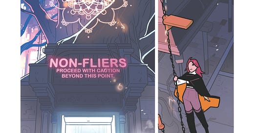
Meredith here, taking over for Kelly today to talk about some of the art process of BLACK CLOAK, featuring a favorite of ours Page 21 of Issue 3 (Issue 3 in print, but it was Chapter 4 on the Substack - Kelly!)
Looks promising, doesn’t it? I was pleased.
When getting started, Kelly gives me a script page, outlining the settings, actions, and dialogues of the characters. This one was especially fun, because it gave me some extra play with the two parts of the city. The Narrows and The Trees.
It’s an interesting dichotomy because there needs to be a balance of disconnect and cohesiveness. Both places are distinct in their atmosphere but must also feel like they were both part of the same city.
For this, the Narrows are based off the small city spaces. The back-alley shops and tiny walkways we have in panel 1. But as Essex gets closer to the trees, the space starts to open into something bigger and grander. Something Essex is only a small part of.
Also, from an artist standpoint, having a different background in each panel gives you a little freedom. It’s easier to go wild when I know I won’t have to actually figure out the nitty gritty of moving a character through the space for an entire scene.
(That involves physics and a minor in architecture. Although there is a lot of magic here, so maybe they need less load bearing walls…)
Anyway, new places, for a short time only. It’s like candy.
My pencils are tight enough that I don’t have to stretch my mental muscles too hard moving on to inking. For me, each step of setting up a comic page is about making the next step a little easier. I’ve tried to go down the ‘I’ll fix it in inks/colors’ road. It does not work for me, unfortunately. (Though, in the practice of textbook insanity, I do find myself repeating these methods from time to time, hoping it will yield a different outcome, and relearning the same lesson. Over and over again). But anyways, if something looks bad in pencils, it probably won’t look great later down the line either. At least for me. So I do my best to just suck it up and tackle problems as soon as they arise.
I am not a fancy inker. With hard solid blacks and orderly crosshatching strokes. Oo la la. I’m really drawn to the cell animation look, so leaving a page with simple line work, where colors have all the room to shine, is my preference. Also. I’m lazy. The most variety I introduce to the inks stage is: stroke width 15 …and stroke width 9.
I am but a simple creature.
This is also usually the point where I flip the picture once, just to make sure everything looks proper. A lot of artists tend to have a drawing bias towards their left or their right. When you flip the picture, you can usually spot which way you lean. (Usually, it’s in parallel lines on a wall or the eyes on a face. The lines all slant distinctively in one direction. One eye is all wonky and not at all where it belongs. It’s usually pretty obvious).
True, there is a STRONG LIKELIHOOD that no one will ever see the page flipped the wrong way around. But the chance is not zero. (In the past, when a book was going from a country that reads left to right to a country that reads from right to left, the publishers would cut corners by just flipping the page around. The results were not always super great and awesome.)
Anyways, you fix what needs fixing and flip it back and then you go to colors. :)
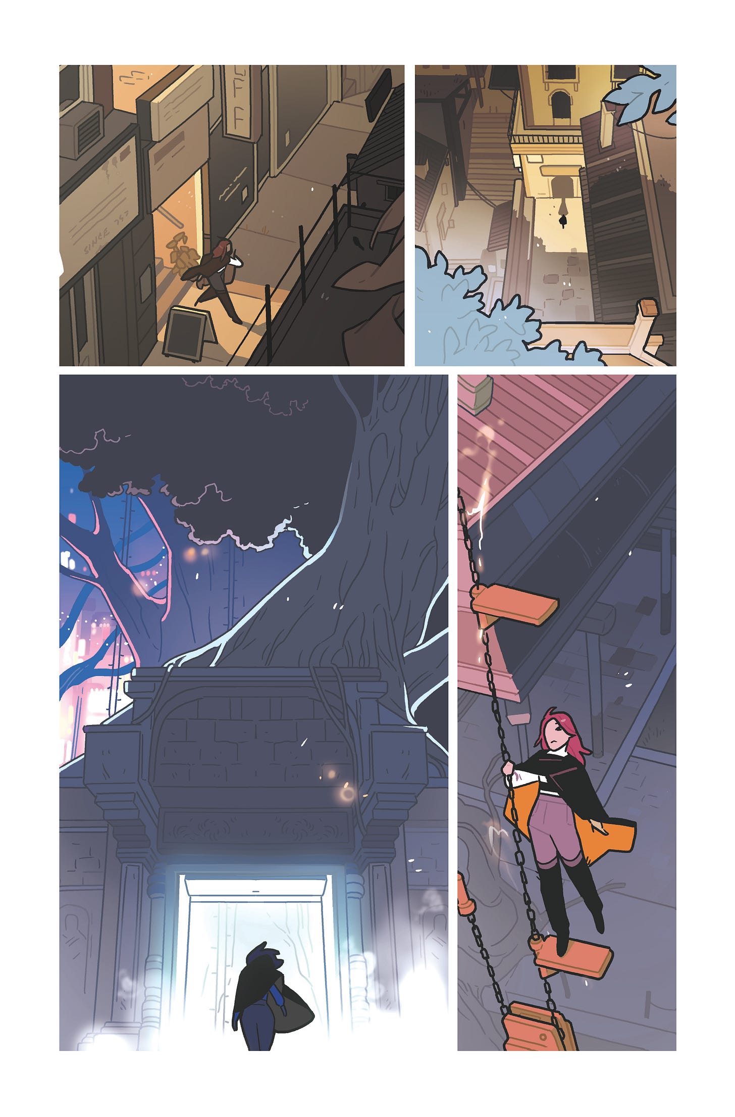
This was the first pass at colors. And I was pretty happy. In previous pages we had established that The Narrows were experiencing a sort of rolling black out throughout the city called a ‘Brown Out,’ making it a little less vibrant. But the light was fading into late afternoon, which gave me a chance to play with some lovely burnt tones.
Unfortunately, this was not the vibe.
It was too cohesive. The Trees didn’t feel separate enough from the rest of the city. They get to keep their magic on during a Brown Out. They’re playing by a different set of rules. It SHOULD feel magical and distant from all the muddled colors of the city. A special place.
Which brings us to:
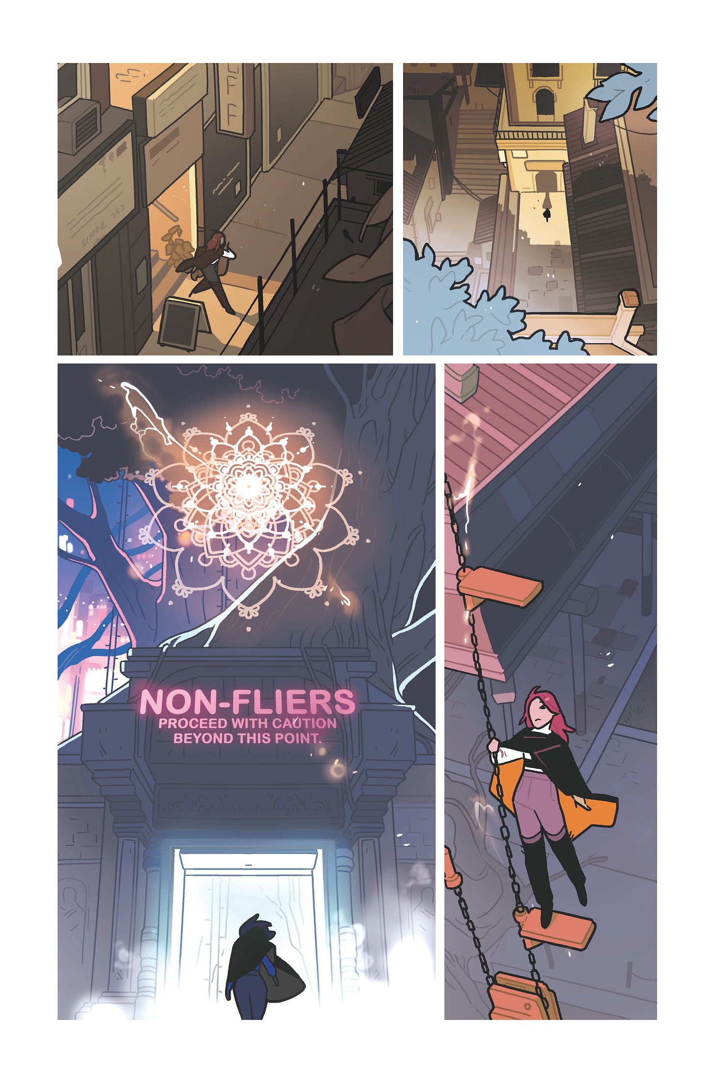
We kept the burnt tones of the first two panels, easing into the neon vibrancy of The Trees. Kelly likes to challenge me (in the best, most loving way) with ‘dark’ scenes that are still legible when printed.
…It’s a learning process. But there has been improvement on my end. The trick that’s been working for me lately is just making the highlighted rim lights as BRIGHT AS POSSIBLE. It makes everything around them look a little darker than they really are.
And with this we were ALMOST there. Just a little bit off. Needed a nudge.
We really had to push the element of this area being just a little more magical, so that meant fitting in a mandala somewhere. And Kelly had this great idea for signage on the gate. Just to really drive home that this is a place Essex is DISCOURAGED from entering. The wordage she decided on fit a little neon sign perfectly.
A little lens flare and we had a page.
Obviously, there’s a couple more steps before the page is printed, but that’s my end of it. It’s fun and rightly challenging, and I really love when I can look at a finished page and say ‘we did real good.’
And on to the next one.
^_^
-Meredith


"Kelly likes to challenge me (in the best, most loving way) with ‘dark’ scenes that are still legible when printed."
LOL
Meredith, this was fantastic! It’s like magic to see your inks brought to life with the colors. So much texture and depth there.