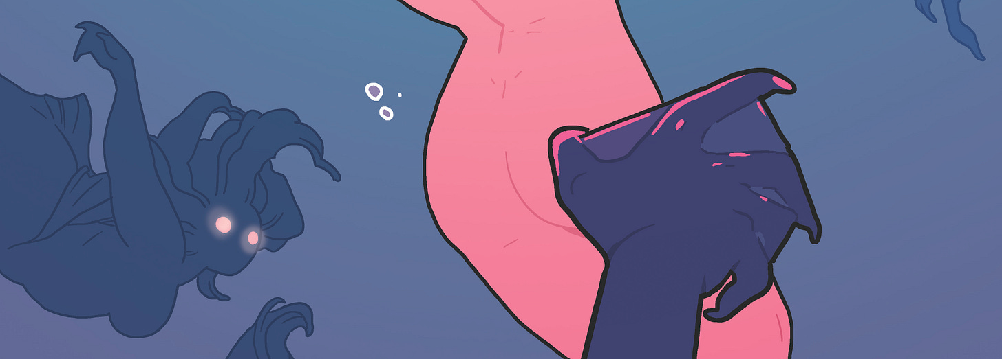
I love process. I sometimes think anyone involved in any creative medium (and plenty of non-creative ones) loves process. I assume because we’re always looking for new/better/more interesting ways to create. And maybe even a secret that will unlock everything for us?
And the truth is that there both is no secret and there are millions of secrets.
Which is to say there is no one magical secret thing that someone can tell or show you that unlocks everything and makes all of this creation and publication stuff easy or possible or successful. BUT there are tons of magical secret things that people can tell or show you that can unlock things for you personally - some are small, some are huge, but they all add up into a lifetime of knowledge and information…all of it eventually leading you toward more success.
Sort of like the exact opposite of “death by a thousand cuts”?
“Success by a thousand magical secrets?”
So a constant striving for information that we can use to grow ourselves is why we crave process stuff so much, or at least that’s my take on it. And so we will be doing a lot of these process posts here, but I’ll try to keep them interesting and varied and valuable and I’ll bring on other folks to interview when possible - because let’s be real, it takes a really talented whole ass village to make comics.
Today I want to look at the cover image that you all saw a couple days ago by Meredith McClaren and talk about why it looks like that - especially as relates to the colors.
Meredith’s original design for the page was very close to the final right from layouts. Her instincts are great:
My only note on this (because I absolutely loved it) was concern that we make it clear that the central figure not be confused as being the same as the others - i.e the central figure is not a mermaid and the others are. And since we can’t see the central figure’s legs clearly - maybe people would assume she too was a mermaid?
Meredith addressed this comment in such an interesting way - and it’s worth noting that I’m sure this was always her intention - just that it’s not AS clear in a rough layout as it is in pencils. Which is all to say, I was likely useless in this process. Go me!
As you can see, in her pencils she fully addressed my comment in a fantastic way - she didn’t make the central character’s legs more obvious, instead she designed the hell out of those mermaids so that they were clearly identifiable as creatures different from our central figure. This pushes all the design and world-building for the book forward in a terrific way, right from the jump.
Meredith has a really clean tight style and her pencils to inks are typically a very easy transition. And she’s an incredible colorist, so while you might not see a ton of variation between pencils and inks…when it gets to color…OH THE FUN YOU WILL HAVE.
This was Meredith’s first color pass on the piece. I loved it. It was moody and dark and ominous in all the ways that I knew were great for what we were trying to do on BLACK CLOAK. But I had a concern we were maybe going too dark too fast - and also that maybe we would get more mileage out of the idea of contrasting something dark - i.e. what looks like a vulnerable person or body, floating amid “creatures” - with brighter happier tones. Meredith took another pass at the colors to try out my idea.
I loved this. Still do. I think the whole team did. It’s absolutely beautiful. But I think we all agreed that the other one was more evocative and felt more accurate to the world we were building and the tone we were trying to establish. At the same time that she was doing this Meredith was working on colors for the opening scene of the book and it was closer to this brighter palette at this point than the moody dark one, but it wasn’t THIS bright, so she tried a third option:
Also beautiful - and brought back some of the moodiness that we had lost - it was also the best tonal match with the opening scene, and the whole team liked that consistency.
I think we all thought this was probably the one we would go with. It made the most sense in a lot of ways - and I believe it’s still our editor’s first choice?
But in the end, both Meredith and I couldn’t escape the tone of the first one - it was so spooky and mysterious. It spoke to us the most about what BLACK CLOAK was supposed to be - a murder mystery set in a wild fantasy world. And so in the end, we both chose it as our top choice.
The morale of this little story might be “artists, never bother listening to your writers!” but I hope it’s something more like — creating something is a journey and sometimes pushing forward in a new direction will actually end up leading you back to where you started - but with new confidence that it is and always was the right choice.
Hmmm. The former sure is catchier. Damn.
Okay. That’s it for now - but I’ve got something a bit funny (and much shorter) for you guys later. Be good and kind when you can - and please wear a mask! <3
Kelly


More, more, more of this please! Love it all 👍👍