Hello!
We’ve got something really special for today - a new “Process Junkie” post - an interview about superhero costume design with the fantastic Carmen Carnero, comic book artist of titles like MILES MORALES: SPIDER-MAN, CAPTAIN MARVEL, X-MEN: RED, HELLIONS and so much more!
I was so excited about Carmen talking to me about this stuff that I wrote way too many questions, so I’m going to break this one up into two parts. Today we’ll talk about her design of STAR and tomorrow we’ll talk about her apocalyptic CAPTAIN MARVEL costumes.
KELLY: Hey Carmen! Thanks so much for joining me on here!
CARMEN: Thanks to you for having me!
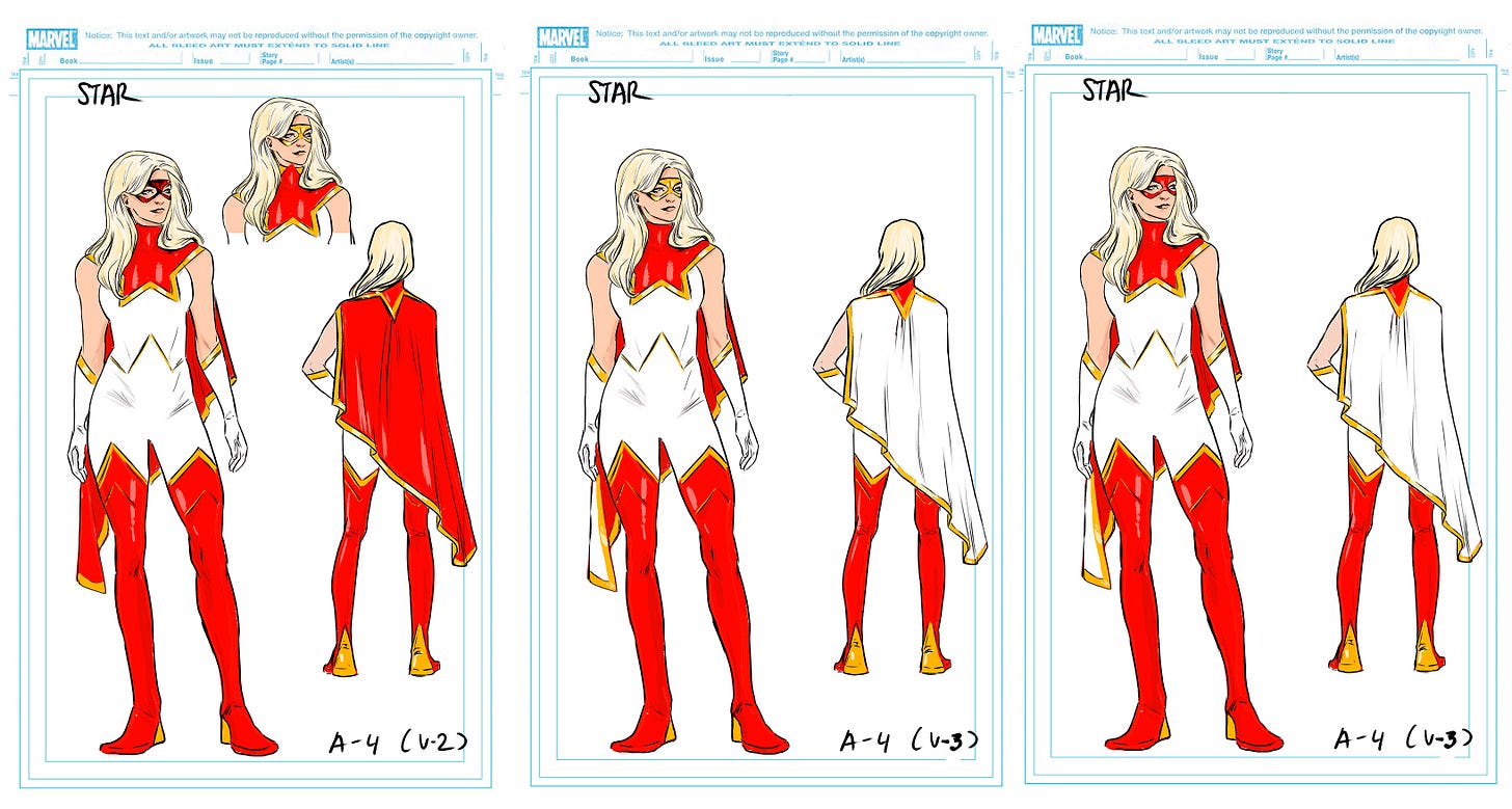
KELLY: Before we start I just want to give a shout out to the lovely David Macho who helped us with a bit of translation - thanks David! So we’re gonna talk some STAR and APOCALYPTIC CAPTAIN MARVEL costume design and we’re going to start with Star because people are crazy for that costume! Star’s look is just a hugely iconic costume. I credit that perfect costume almost entirely with the character’s initial popularity – did you have any idea she’d be SO popular right out of the gate? Did you feel we had something really special when we locked in the final design?
CARMEN: I didn’t think people would love it so much, so fast, no, but I did know the issue would be a success and the beginning of a great arc. It was one of those times when you know since the beginning it’s going to be a very special issue, because of the presentation of Star but also because of the varied storytelling I would be able to draw on the pages. When we locked the design, I didn’t have the slightest idea it would be so popular but I believe the key to its success was us picking the option that reminded people of a classic superhero.
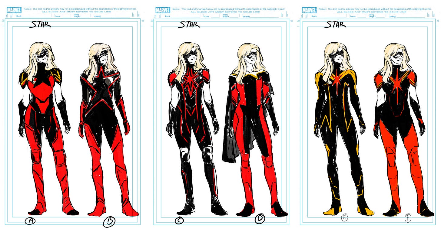
KELLY: Yeah, I think you’re right. When I look back at those first passes – it’s so clear that WE knew we were building a villain from color palette alone. But I think the notes back from that first round were that there were tons of good ideas but that it just couldn’t be black because though WE knew she was a baddie, we needed her to be pretending to be a good guy. Which totally changed the direction. Right?
CARMEN: True, I remember that in the first designs the general note was that it should be heroic, but it should also work for a villain later on. That made me try something more typical, like a tactical suit, there’s no movie/tv where the hero or villain always has a suit prototype, something more home made. That was the original idea, being true that the combination of black and red made it look as if the balance was shifting more towards villain. That was the moment when we decided it shouldn’t be ambiguous but to trick the readers so they thought she would be the new hero taking the spotlight away from Carol.
KELLY: Exactly! Did you miss the black when we switched it up, or were you excited?
CARMEN: Absolutely not, that gave me more freedom to try other combinations. I remember red was a must (I didn’t know why until half the arc was done, LOL).
KELLY: Sorry about that! It was a while before we were sure the Infinity Stone thing was going to work, but we wanted the red there just in case!
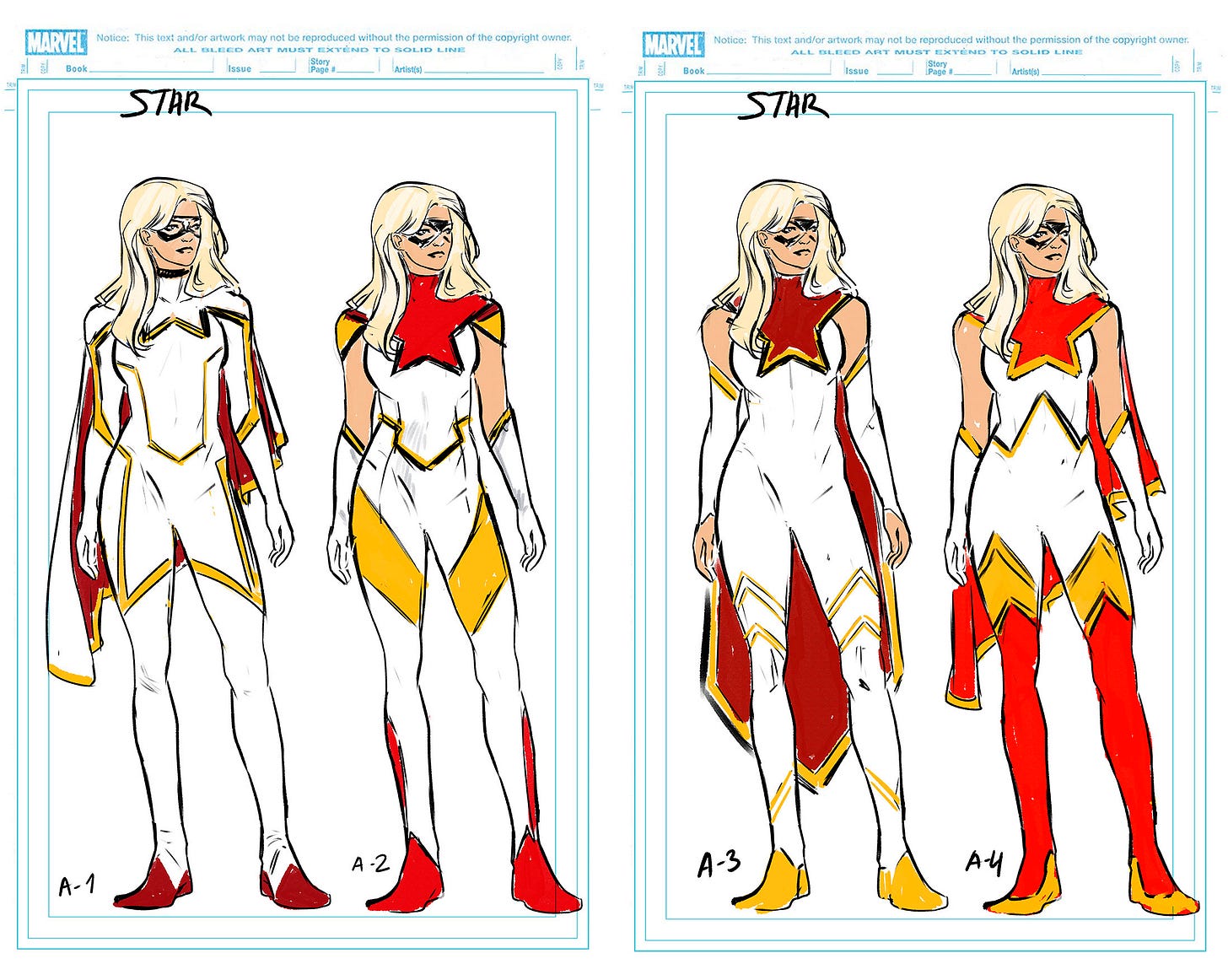
CARMEN: Well, I tried several combinations of colors. I remember I even tried the same colors Carol had but with another design and it didn’t work because we all thought the white worked better.
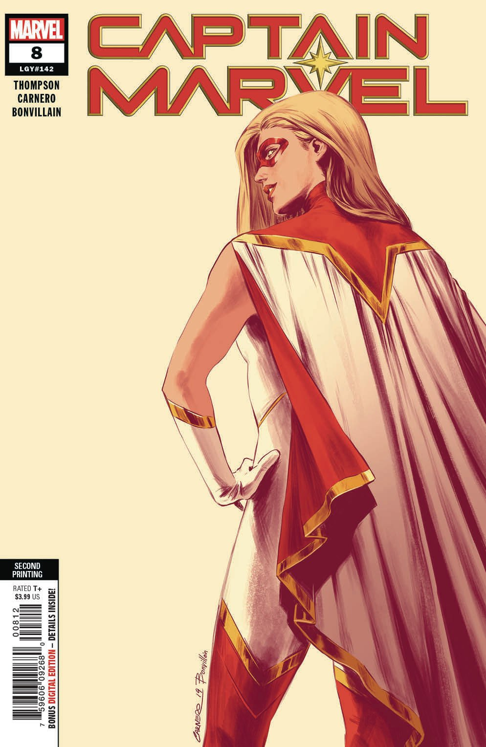
KELLY: The white was sort of thrilling to me, but nothing was more thrilling than that asymmetrical short cape! I can’t remember whose idea it was to make it red on the underside, but in my memory (where I am OFTEN more impressive than in reality) it was my idea. Confirm or deny? LOL
CARMEN: The white/red along with the asymmetrical cape was the next option after the first feedback, I remember it was a crazy thread with the whole team giving their opinions and exploring options. I don’t remember whose idea was the red on the cape’s interior, but I don’t remember what I had for lunch yesterday. Since I work in comics I’ve become Dory and I don’t remember anything, hahaha.
KELLY: That sounds like confirmation to me! ;D
KELLY: The white of Star’s costume was such a deliberate and smart story choice we made, but it’s incredible how much it dictated what people seemed to think of her. Despite her horrific actions on the page, people saw that white costume and kicky cape and just thought “hero.” It really gave me some perspective into how powerful design can be – for good and ill. Did you have any of those experiences?
CARMEN: Yes, once white was decided, in my head the suit would only work if we really made everybody believe we had a hero that was better than Carol and so that influenced Star’s poses, and I drew her as classic and heroic as possible. It’s something you stressed a lot in the script and it helped us make the readers doubt. And it worked. Nobody saw it coming.
KELLY: Yeah, we totally pulled it off! Which is so hard in comics these days! When you’re doing costume design like this do you prefer to design for an all-new character or to do a re-design for an existing icon? I’d guess both have their advantages and disadvantages?
CARMEN: New character, no doubt, because redesigning a character can be a terrible pressure, at least for me. A new character is like a blank canvas, it’s my idea from scratch that I then refine with the writer. More than once the design also gives ideas to the writer and that’s a beautiful part of this job. I also enjoy re-designs, but sometimes the original suit is simply perfect and you don’t know where to start, which means a lot more work.
KELLY: Great design totally inspires me, you’re right. Sometimes all it takes is a fantastic drawing of a character by a particular artist to make me interested in that character. It’s very powerful stuff.
Okay! I’m cutting it off here for now! But tomorrow I’ll post Part 2 where we talk about the apocalyptic CAPTAIN MARVEL costumes and lots more!
Until then, be kind to each other, and yourself. <3
~Kelly



As someone with little to no artistic/design talent, I love watching the behind-the-scenes featurettes on my favorite movies and realize how much thought goes into the design choices for each character's costumes, homes, etc. I feel the same way about this post (and these Process Junkie features, in general). This is all fascinating but the biggest slap in the face moment of your interview with Carmen was how important/imperative red was to Star's costume design. BECAUSE OF THE REALITY STONE. I didn't even get that after the Reality Stone reveal happened! That's awesome. (Imagine I have inserted multiple "Wow-Stars-In-Eyes" emojis here.)
Love the interview and process discussion! (Also won't lie to you, 1,2,3,5,6 in the row of black costumes would look great on Carol)