Hello!
Week Two is upon us! I’ve got some really cool interviews about design with amazing artists lined up - but I wanted to kick off with some cool ass BLACK CLOAK stuff - picking up on the process post from last week about the evolution of that incredible first page - especially as relates to the colors and setting a tone for the series as a whole.
So I’ve decided to call these posts “Process Junkie” and they’ll be an ongoing series sort of excavating projects - both the ones I’m developing here - and beyond.
These are still free for now as we spread the word in these first few weeks, but if you want to keep seeing stuff like this, you should definitely consider subscribing if you haven’t already:
Okay! Let’s get into it!
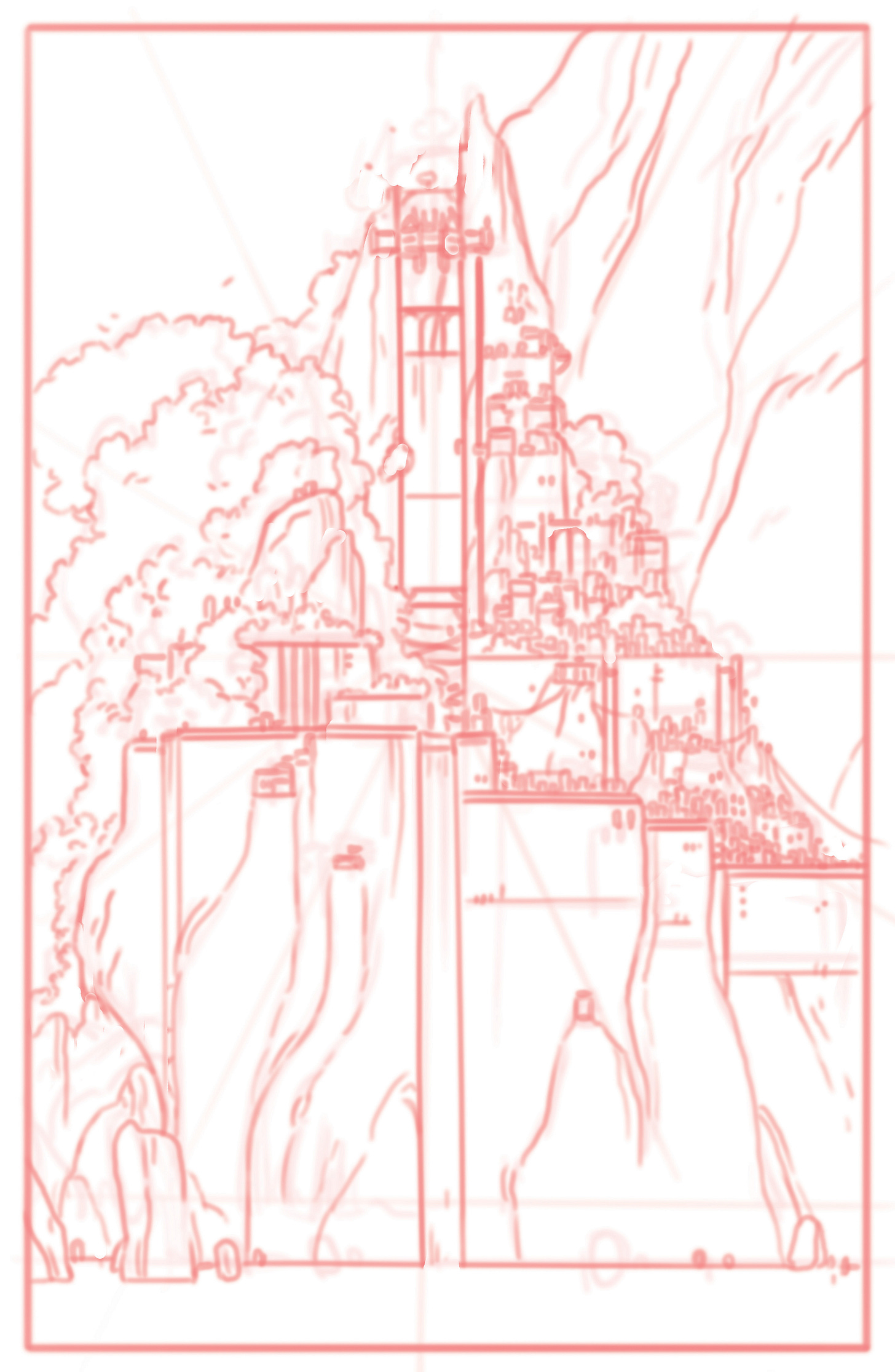
Let’s see what worked and what didn’t and how we ended up where we are now. These are Meredith’s first incredibly realized pencils. You may remember HOW incredible this is in part from my “Maps are Hard” post from last week where I show off what an idiot I am at drawing maps. Good times:
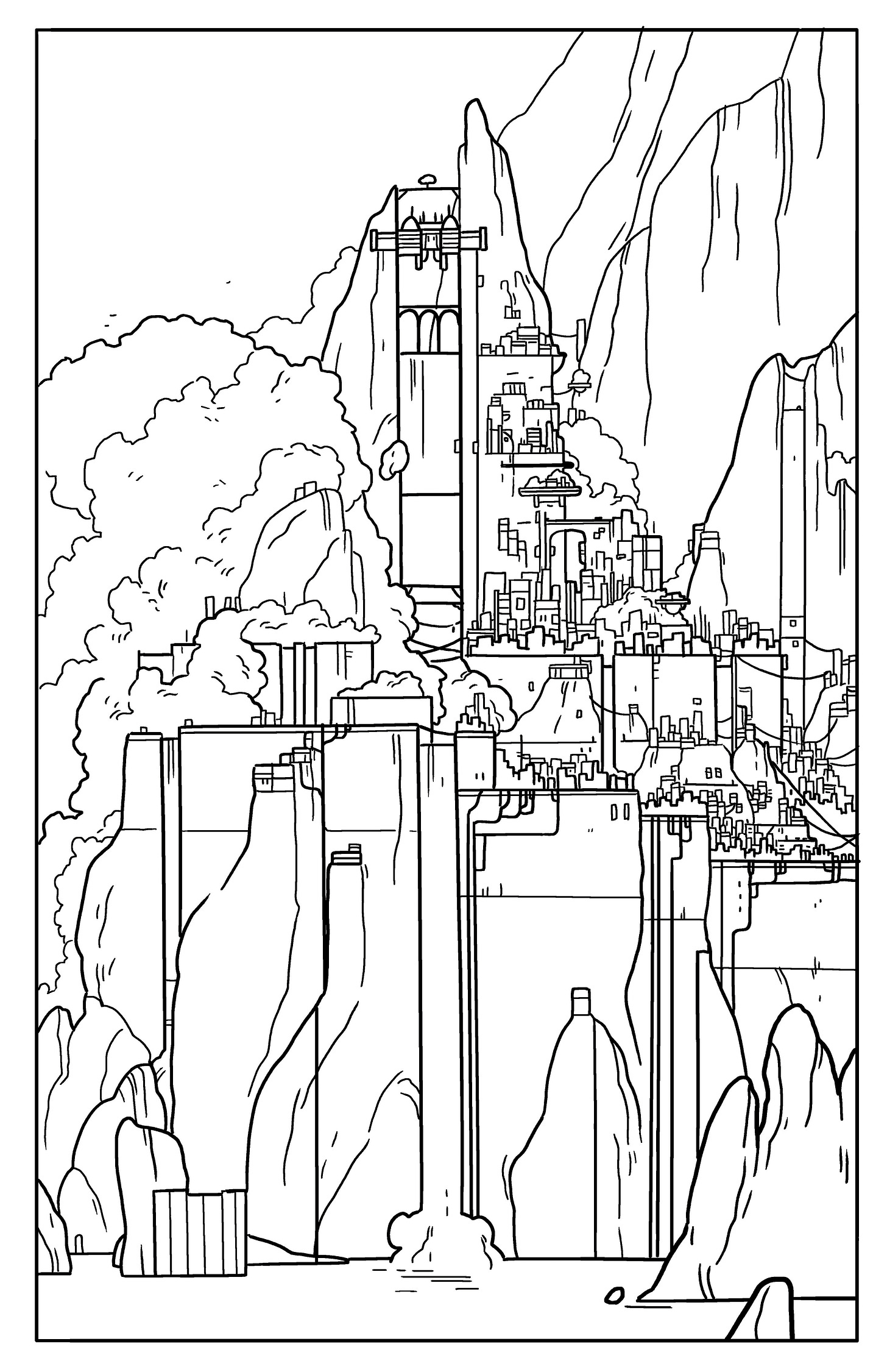
As you can see she went in and added some sharpness - hard edges and stuff that just feels more tech-y and “man”made. From the jump she really captured a blend of the sort of futuristic sci-fi neo-noir thing we wanted to feel built on TOP of an older and more traditional “fantasy” civilization. Her inks, as usual, are a very direct translation of those pencils:
Her first pass on colors felt very right to both of us in that the image had that bleaknesses…that darkness that we all tend to associate with neo-noir futures. It just FELT right. We had some concerns about readability (something printing overly dark can be a killer), but we both loved the dark moody tone it was setting right out of the gate. We were excited:
But here’s where having a great team that you trust comes in. I think, left to our own devices, Meredith and I would have just stopped here. We were so excited about the design of the city and it was SO early in the process of building this world, that we just saw this awesome page and both were like “well, that’s done!”
But our editor Charles had some thoughts - it WAS too dark, and while the mood it was setting was great, it probably wasn’t going to print super well, and we were losing any of the sort of neon-fun that he knew we intended. He made some specific suggestions and asked some specific questions. Meredith went back to the drawing board and what she came back with was spectacular:
I honestly couldn’t believe the difference. This was a whole new world…and it was better than the one we had already started believing in!
Even though it was less moody than the first pass, it still felt neo-noir and futuristic with the added/pumped up neon colors and all the hard angles and suggestions of tech. But now lightened dramatically you could see so much more detail in the city and it just told you so much more about the world.
It also felt more hopeful…which is a tricky needle to thread neo-noir futures are by their very nature pretty dark, but that doesn’t mean hopelessly grim…or it doesn’t HAVE to. And this felt more like the world I knew we were building.
Even though this wasn’t what we ended up using for our final, it’s still my favorite from a color perspective (I just can’t get over the beautiful blue tones of it) and it’s a great example why “your favorite” doesn’t necessarily mean “right.”
I post this one mostly to show that not everything you try always works. The sort of “electric” vines were a suggestion from Charles that Meredith tried out but that we all agreed didn’t work and were too distracting.
When Meredith did this pass, she had also begun coloring the opening scene, and so as she developed that she went back to my beloved “blue tones” pass that we had all sort of agreed was “the one” and tried a slightly less saturated and greener-hue. Charles and I both agreed with her that this fit the story and worldbuilding much better than my beloved “blue tones” pass. Even though the other was my favorite, this wasn’t about choosing a favorite - it was about choosing which image fit with the story, which was the most informative, and which tonally felt in sync with other things we were still building.
But Charles and I both agreed that the neon of the city went too orange and red here - almost suggesting the city was on fire, instead of just bathed in badass neon. Which led Meredith to her final pass:
And this one was…perfect.
It embraced all the world building that is so important in a page one image - an image that intrigues you and gets your imagination firing from the jump. And it said so much about our world - but it also now well-reflected the tone and mood that would follow it in the opening scene - and that we needed to establish from go.
In the end, an absolutely incredible solution…to a very tricky ask on the first page of a wild new futuristic fantasy world.
I’ve already said a few dozen times that Meredith is a badass, right? ;D
Okay, that’s it for now, I’ll be back this week with what I think are going to be some very cool interviews with a few different creators talking about design process. Until then, be good and kind when you can, wear your mask, and subscribe!
Or if you’ve already subscribed, maybe tell your friends? Here’s a button for just that!
xo - Kelly


So.. Meredith is a stone cold legend then! 👏👏🤯👏
Man! These are great designs!